Can My Local Business Benefit From A Website Redesign?
Since it’s inception, we all know that we can find an answer to anything online. Basically, the internet is loaded with useful information. Every user is trying to find the best and most trustworthy source of it. With so many websites available, people have become picky about what they read. That’s why you should put a lot of thought and effort into creating or redesigning a website for your local Houston business.
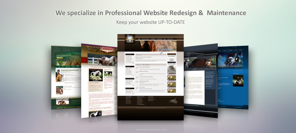
Websites are redesigned and then sport newer themes, colors, and designs. This makes them look more appealing to visitors and certainly contributes towards bringing in higher customer traffic. Redesigning often leads to a change in images, graphics, fonts, colors, text, and backgrounds and this keeps the website fresh in the public eye. Not to mention, Redesigning your business website often clears up clutter and helps websites load fast.
Even if you already have a web page, you may feel that it needs a redesign. But where do you start? The ultimate answer is the simplification. As soon as you make your website easy to use and navigate, you will see a huge change in page traffic. Here are some things that will benefit your business website:

+ Relevant And Contemporary Look And Feel
+ Fast Loading Time
+ Properly Structured; Offers Direct Insights Into The Purpose And Nature Of Business
+ Higher Lead Conversion And Sales Volumes
+ Appealing Look On Mobile Devices
+ User Friendly In Terms Of Design And Navigation
+ Updating Content Is A Breeze
The main thing or question is, how do I make my website simpler? Here are 5 tips for you that can help you in your redesign.
Find Out What Is Essential
Before getting rid of any information on your web page, it’s important to understand what should stay and what should go. Although this first step may seem obvious, sometimes it may be too hard to understand which information should stay as all of it may seem essential.
The best way to go about it, is to follow the 80-20 rule. The 80% of the traffic you get comes to read the 20% of the information on the page, so you should concentrate on this 20%. Such a simple change will boost the rate in subscribing, signing up and buying right away, which is actually the ultimate goal of your website.
Getting Rid Of Excess Information
Once you’ve identified your essential 20%, you need to choose what should be erased from your website. In fact, 80% may seem a big amount of content to get rid of. But think about it, if there is any point in keeping the content, if it is not of any interest to your traffic. This may include some sidebar elements, blog post details like author, date or time as well as links in the footer.
Reduce The Number Of Pages
Having dozens of pages has never been a good option. This complicates the navigation as users get overwhelmed by the choices they have. This ends up with choosing nothing. No one wants to spend their time on skimming through loads of information in search of a required item.
A major part of the redesign is getting rid of the pages that have no practical value. For example, you definitely don’t need to separate pages for ‘about us’ and ‘about me’ info. Even though the pages in your situation may be not so obvious, we are sure you will find such – hidden duplicates – effortlessly. The fact that other websites contain a particular page doesn’t mean that you need this page as well unless it works for your business.
If you are not sure if you can delete the information on certain pages, try to merge two pages into one. This may work well especially for pages like – Contacts – and – Where to find us-.

Revise Your Layout
Many studies have proven that most people spend most of their time above the fold. That is a part of the web page which is visible without scrolling. Make sure that your fold contains all the necessary information or at least links to it. Also, check whether the sign up box is located at the top of the page. Overall, attracting potential clients is the main purpose of the web page, so there is no need to put it somewhere at the bottom.
Simplify Your Color Scheme
Designers today often go for bold vibrant colors for web design. Yet it doesn’t mean that you should use all the colors of the rainbow. Keep it up to 2-3 colors and play with them. A well re designed website built with the right approach can effectively make a positive impact on not just your customers, but also on your sales. Which is why it’s necessary to create websites which infuse the right balance of user experience and interface. Simple is always better.
Conns About Website Redesign
When it comes to the cons, there are some natural ones of course. Understandably, adapting to any new layout and technology takes a minimal amount of time and this will have to be given to you and your customers alike. This is a natural development but if the user experience remains good and the design and menus are neatly arranged and uncluttered, you can expect to win plaudits for the new look as well.
Changes in URLs can be tackled with SEO as search engines can easily be informed as to the older ones.
Cruz Online Marketing knows that website optimization and simplification are the keys to Small Houston Business success. By providing your potential clients with enjoyable browsing experience, you provide your business with devoted clients.

